A New Beginning
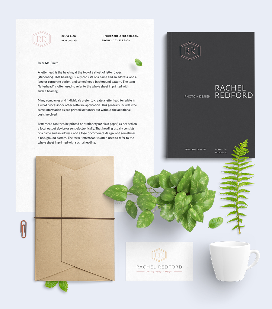
I recently decided to undertake a personal branding project. I have gone through a couple simple logos since getting more into photography last year but needed a complete personal brand mark, especially since I have a website in the works and hope to move past the semi-professional photographer and designer mark soon. Two complete brand marks, vector based, with non-type elements were the requirements.
Ideas and Sketches
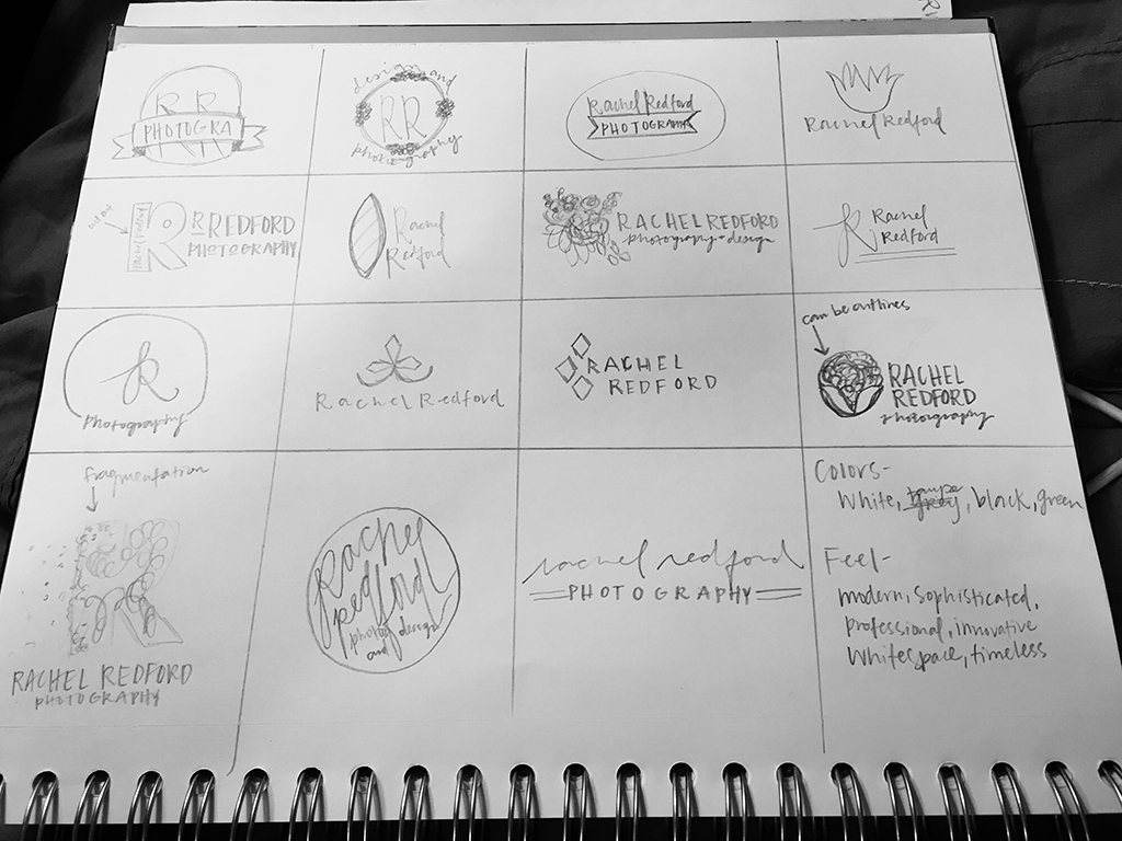
I started by sketching any ideas that came to me: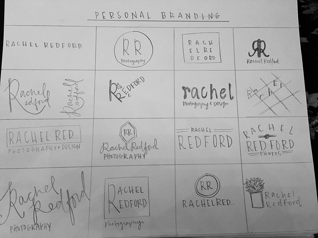
As it usually goes with sketching, the ideas come slowly at first but then I can’t turn them off. I kept thinking about these designs well after I had gone to bed. Each brand mark represents a modern, sophisticated, professional look – I wanted to make sure my brand would be taken seriously.
Moving to Vectors
After getting feedback from my peers it was time to move on to digital sketches. I wanted my personal logo to be a beautiful piece of art so the first one I chose to sketch digitally was the big floral logo. One challenge I found was creating a hand-painted look using my mouse and computer. After trying a couple different brushes in Illustrator, I ended up using the watercolor brush and trying different strokes until I achieved a look I liked.
I also tried hand lettering with a brush tip marker on my sketch pad. I brought the lettering into Photoshop and cleaned up the background, then moved it to Illustrator where I used image trace and expand to turn my hand writing into a vector.
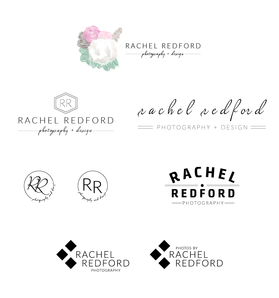
I then made vectors out of a few other sketches and kept going until there was no more room on my art board. From here my favorite brand marks were the top three seen below. The fonts I used initially were Lato Thin/Hairline and Lush Script from the Adobe TypeKit.
Refining
After letting my designs stew for about a week, I got some more feedback and critiques from my peers. With their help I decided to focus on the hexagon logo and the flower logo.
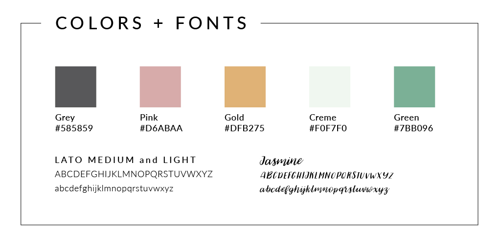
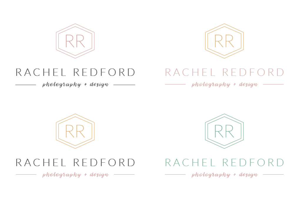
First finalized colors and fonts:
These colors are soft and pretty while also strong and bold, which describe my style. I chose Lato and Jasmine for my fonts because they show both sides of my style as well. Lato is sans-serif with thin lines and sharp corners/shapes which makes it modern and sophisticated. Jasmine is a hand-lettered script font which makes it personable and fun.
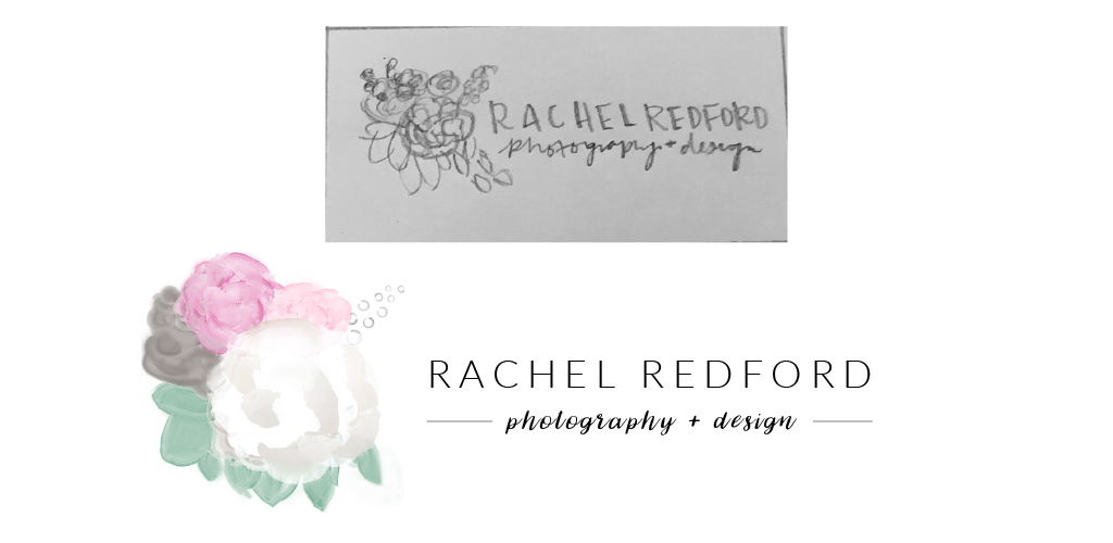
The flower logo needed refinement on the leaves and the circle details on the top-right. I reshaped each part until it looked more professional. I also smoothed out the coloring. Here is the final result contrasted against my initial sketch:
The hexagon logo needed refinement on the spacing and colors. The lines at the bottom were too close to “photography + design” and the brand mark needed to be higher. I also worked on color variations.
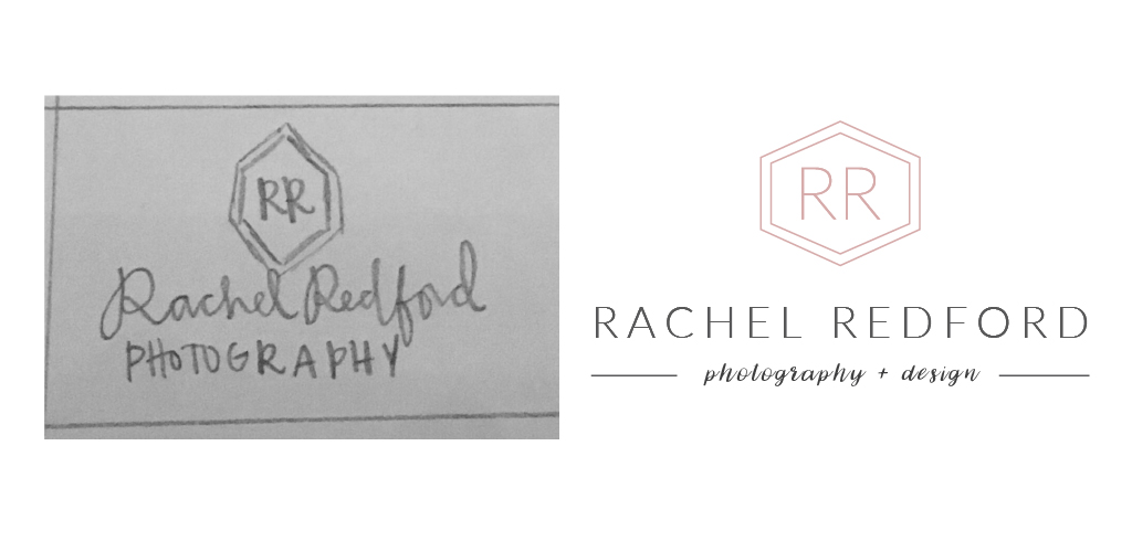
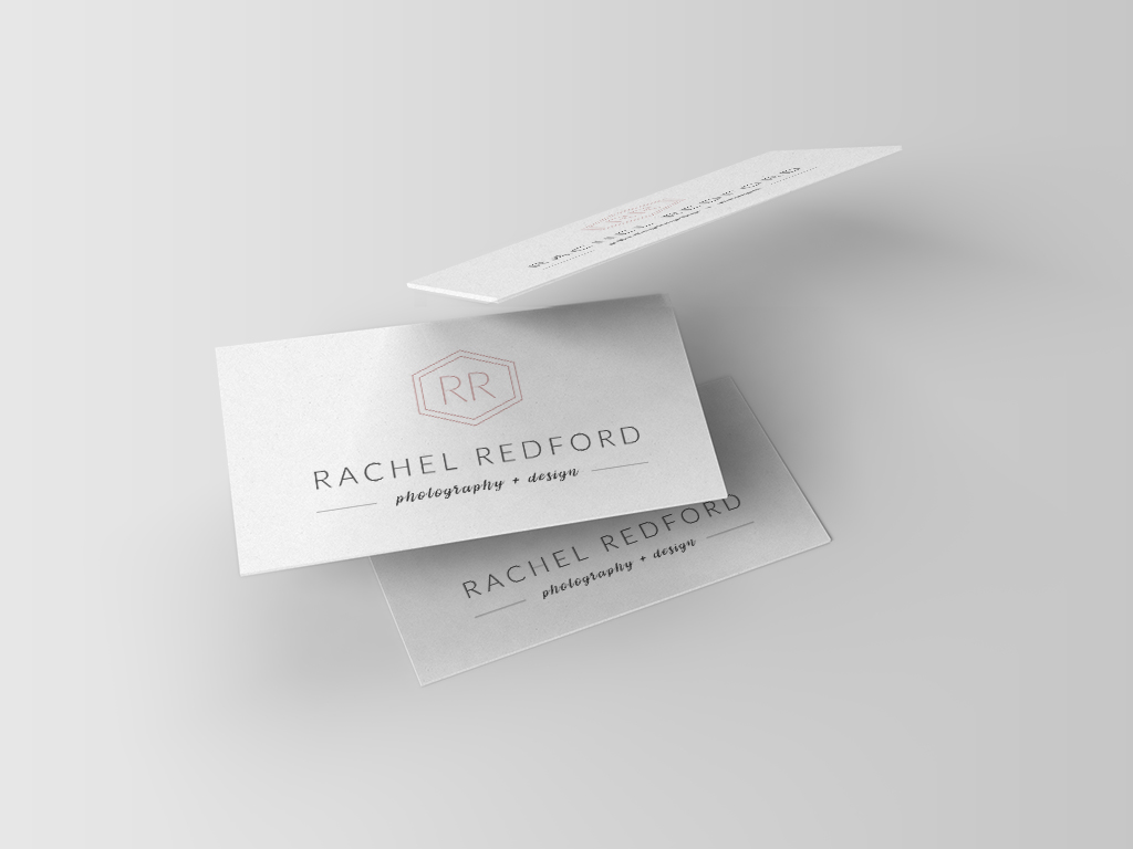
In the end I landed on the hexagon logo as my favorite and the one I will be using. I love the flower design but the hexagon will be more easily recognizable and more timeless. The hexagon also maintains the sophisticated, classy, and modern look I want to project. Here is my final logo along side the original sketch:
The Final Product
I am rather pleased with how this project turned out. I think these two final logos help me move past my status as a semi-professional photographer and designer and into the professional world.
“Art is never finished, only abandoned.”
Leonardo da Vinci said that but I feel like this art is finally finished. My new brand mark represents my personal style as a photographer – clean, sophisticated, modern, and straight-edged yet soft and beautiful at the same time.
What do you think? I would love to hear any comments or questions about my personal brand mark.
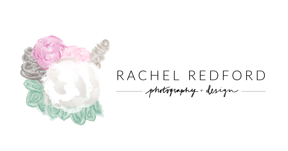
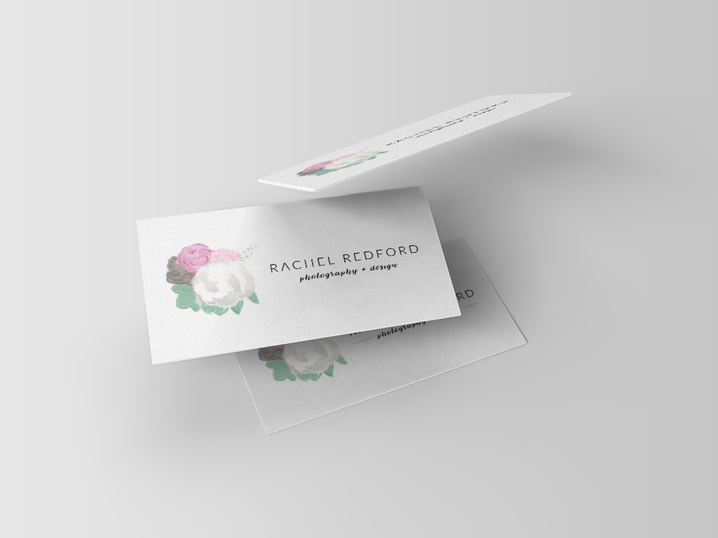
P.S. just for fun, here is my flower logo:

