Learning about Movie Poster Magic
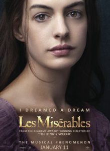
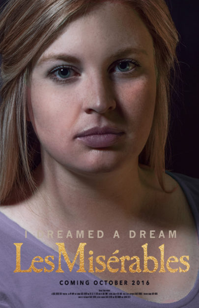
I recently talked about the work of Annie Leibovitz and how much I admire her photography, so with this project I knew I needed to choose a movie poster featuring her photography. The character posters from the 2012 release of Les Miserables always stuck out to me because I love the musical and the artwork is stunning. I chose to mimic the lighting in the poster of Anne Hathaway.

Annie Leibovitzs Les Miserable movie poster
Getting that Magic Lighting
The lighting in this movie poster is loop lighting, moving toward Rembrandt lighting. I set up a speed light with a rogue flash bender on my right, a black sheet pinned to the wall behind me with a continuous light facing the sheet, and a gold reflector on my left. The biggest thing to overcome was the angle of the light and my posing. I had my cousin stand behind the camera to make sure I was in the frame then I set the focus and the timer, pressed the shutter and took my self-portrait.
Taking the Image into Photoshop
After taking a lot of shots, I finally ended up with one I was happy with. I then worked a lot with dodging the highlights and burning the shadows. I also changed curves, levels, and color tones. I changed my white shirt to purple and smoothed out my skin. Lastly, I masked a gold foil texture over the “Les Miserables” title and added the rest of the movie poster text. I received critiques from Hannah Cummins and Gerardo. They both suggested I bring up the lighting and the dodging.

