Rebranding
Science Interactive
When Hands-On Labs acquired eScience Labs in 2019, the design team had our work cut out for us. Here’s a sample of how we brought two companies together under one cohesive brand.
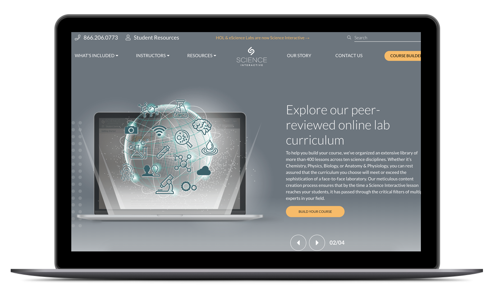
Website + Digital Elements
We created modern, high-tech images and icons to showcase our innovative company. A color palette of grey, white and yellow stood out from a sea of competitors who primarily used greens and blues.
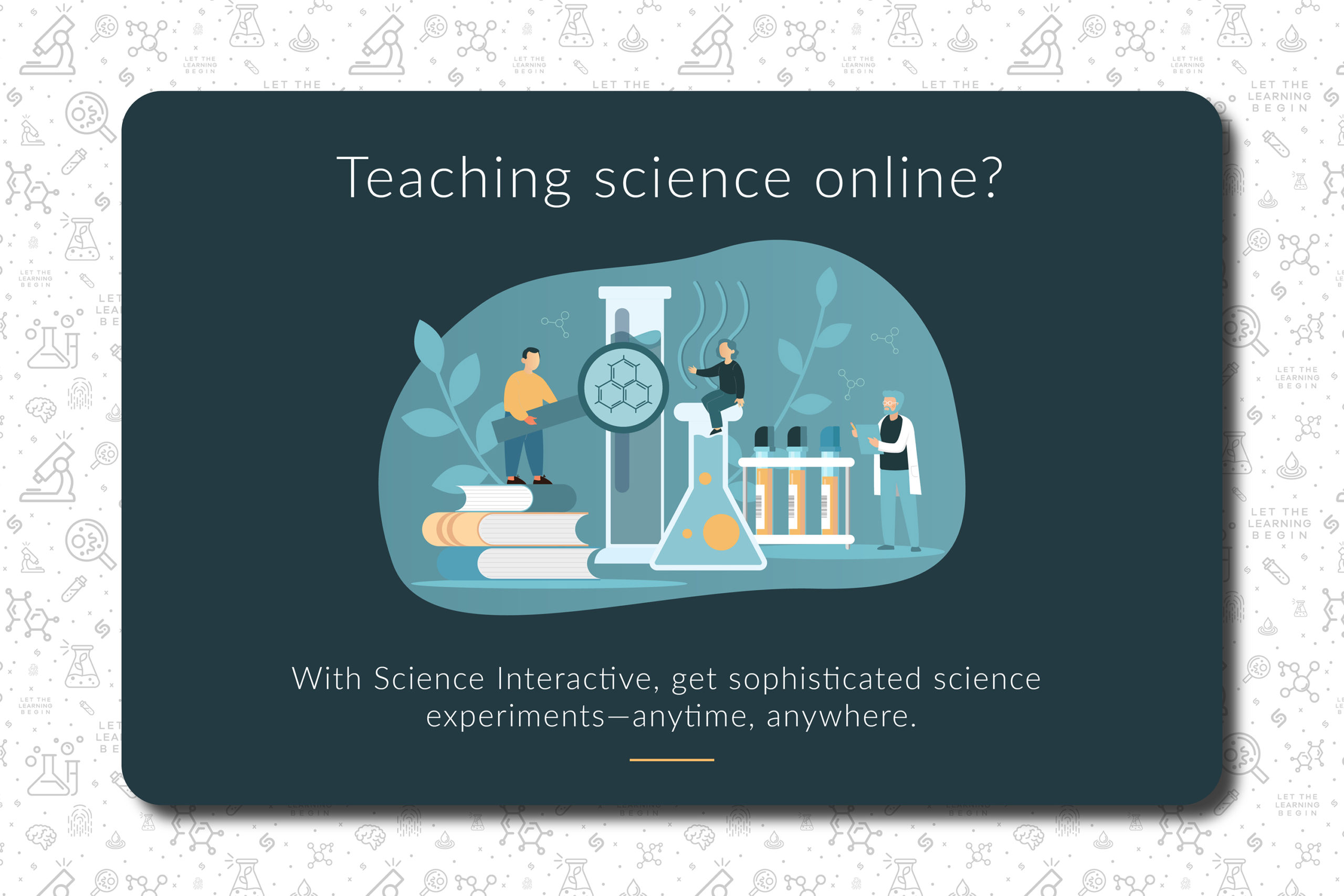
We also created banner ads to be used across social media and science education websites targeted to university professors.
Logo
The new Science Interactive brandmark has a lot of symbolism. The two curved parts that make the “S” symbolize bringing together students and teachers. The dot in the middle brings in the “I” of Interactive.
The upward angle of the brandmark represents forward thinking and innovation.
The typography is Galano Grotesque. We used this industrial style sans-serif to show modernity and simplicity.

Kit Packaging
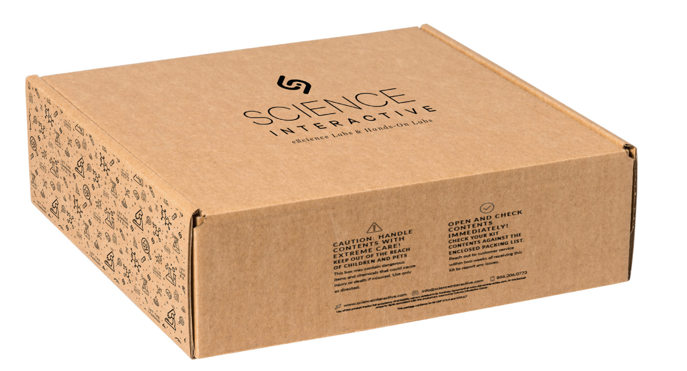
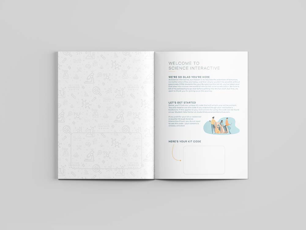
Along with the digital side of the brand, we designed a complete set of packaging for the kits that students received.
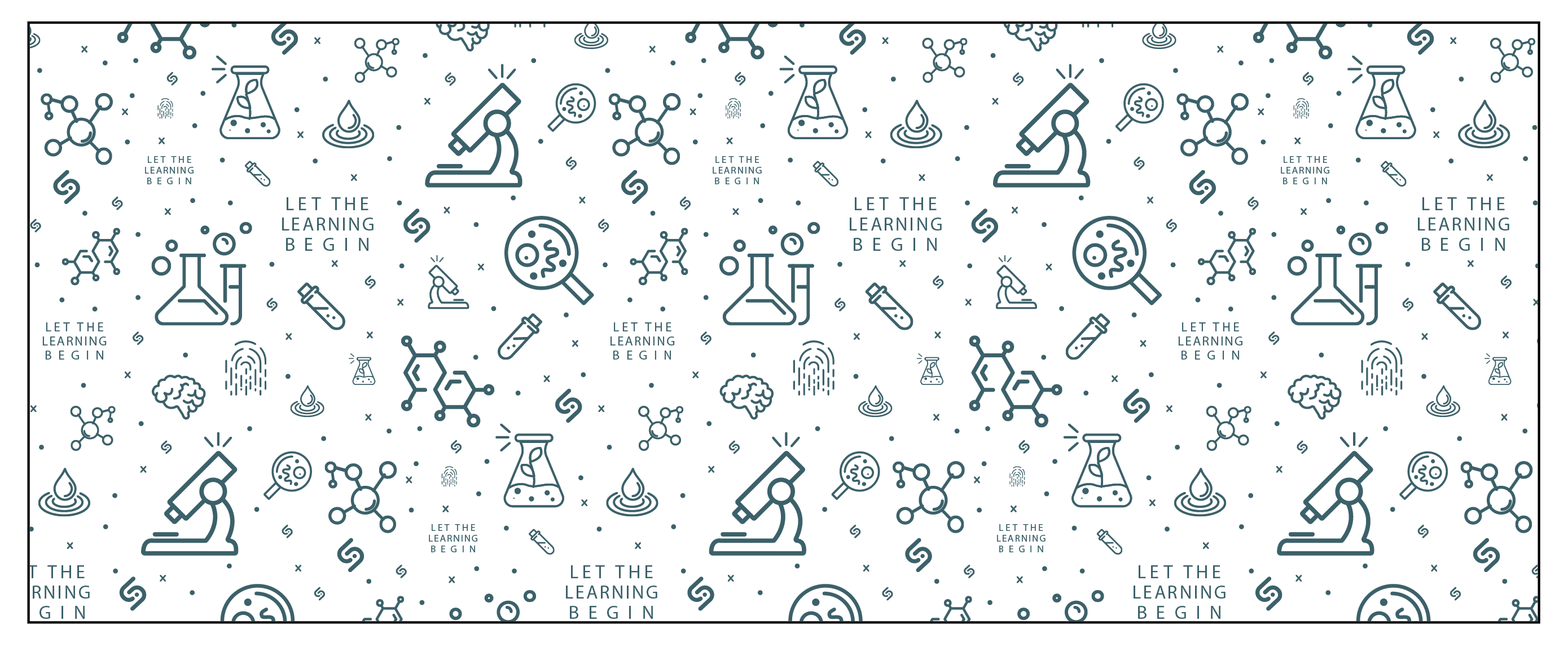
The custom pattern makes science fun! Additionally, we made a welcome guide so students can quickly get acquianted with their new kit, read up on lab safety, and get setup with their online account.

